Page 8 - Rouyer_Fromentin_2008
P. 8
18                                 Mar Ecol Prog Ser 359: 11–23, 2008


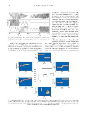
                                                                          5 displayed a decrease in frequency with
                                                                          time, while that consisting of WS 3, 6, 1 and
                                                                          4 displayed an increase in frequency with
                                                                          time. Examining the cluster in more detail
                                                                          confirmed that the procedure grouped the
                                                                          WS displaying similar time–frequency pat-
                                                                          terns. For instance, WS 1 and 4 displayed
                                                                          continuous time–frequency patterns that
                                                                          were the same from t = 0 up to t = 150 (see
                                                                          also Fig. 6); these were the closest of the
                                                                          dataset. On the contrary, WS 2 and 5, that
                                                                          displayed a discontinuous decrease in fre-
                                                                          quency with time, only shared a reduced
                                                                          common area that was expressed through
                                                                          the height of their connection in the cluster
              Fig. 5. Simulated dataset. The time series were designed to produce con-  tree.
              trolled and contrasting time frequency–patterns on their wavelet spectrum
                                                                            In order to illustrate how the multivariate
                                                                          method classifies the wavelet spectra, the
                Applying the classification method with a covariance  first leading patterns, first singular vectors and the re-
              threshold set at C = 99% of the total covariance, thus  constructed WS by the first axis were plotted for the com-
              retaining all the details between the wavelet spectra,  parison of WS 1 and 4 and the comparison of WS 2 and
              clustering the results produced a cluster tree revealing  6 from the simulated dataset (Fig. 6). These 2 compar-
              2 main groups (Fig. 6). The group comprising WS 2 and  isons were contrasted, as the time–frequency patterns


              Fig. 6. Wavelet spectra (WS 1 to 6) and cluster tree for the simulated data. The colour gradient, from dark blue to dark red, codes
              for low to high power values. The cluster tree was obtained using the distance matrix constructed for the simulated data using
              the classification method. The covariance threshold was set to C = 99% of the total covariance. Curved dashed lines: limit of the
                                        cone of influence, the area where edge effects are present

